Best CV Fonts: Top 10 Picks & Formatting Tips
Having a clear, crisp CV font can help set your CV apart. Here’s our picks for the best fonts for a CV and how to use them.

Our customers have been hired by:*Foot Note


Best fonts for a CV
Having a stand-out CV is more important for getting a job than ever, as recruiters today are dealing with a higher volume of qualified candidates than ever before. Having the right content and having a good CV template are key for making a good first impression, but many don’t realise your CV font can have just as large an impact.
A good CV font should be:
Legible: Don’t choose a font that is overly stylized, very thin or very condensed. Readability is the most important goal.
Professional: Avoid any font style that is cursive, designed to imitate handwriting or intentionally informal (for example, Comic Sans) along with any fonts that are extremely visual like Souvenir or Eco fonts with lots of large dots.
Consistent: While there are a number of fun, gimmicky fonts to choose from it is important that you stick to one that has a professional air and only change fonts if necessary like to distinguish headers or section titles.
Pass the ATS test: Don’t fall into the trap of thinking that something unusual will be beneficial by default. Overly fancy fonts may be problematic for the applicant tracking systems (ATS) that employers use to scan CVs. Don’t get fancy with your font and create an issue that leads to your CV being discarded without consideration.
What are the best fonts for a CV?
Generally speaking, the best CV fonts are those that fall under the Sans Serif font category. These fonts are best for CV and cover letter writing because they are simple, clean, professional and easy to read for the average ATS. While the default font in a word processor tends to be either Arial or Times New Roman, a professional CV doesn’t need to stick to one of these two fonts. Here are some of the best fonts for CV writing:
● Arial
● Cambria
● Calibri
● Garamond
● Times New Roman
● Helvetica
● Georgia
● Tahoma
● Trebuchet MS
● Verdana
Within these options, you can also personalise your CV by using italics, bold typeface, headers and subheadings to distinguish one CV section from another. This will give a sense of structure and organization to your CV.
What should a CV’s font size be?
Keeping your CV concise is of great importance if you want to stand out and many people try to use very small font sizes to get all of their information onto one page. This is not a great idea. While you do have some flexibility with font sizes, you should go no lower than 10.5 for the main body of your CV. Any smaller number runs the risk of making your CV illegible. To maintain readability, you should use font sizes based on the following guidelines:
Main Body
Depending on your font choice, the main body of your CV should have a font size of between 10.5 and 12. A font size of 12 is considered standard, while 10.5 would be exceptionally small. If you want a little extra room to play with and you have a very clear font type, size 11 would be a good choice.
Headings
CV headings should stand out from the main body of the document to allow hiring managers to identify sections of interest quickly. A professional CV will have distinct headings; increasing the font size one or two points above that of the main body is a good idea. For example, if your default font size is 11, your heading should be 12 or 14.
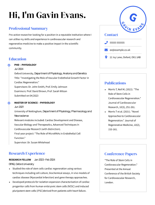
Your Name
Your name should be immediately noticeable at the top of your CV. With that in mind, a font size of 18 to 22 is recommended, as it will ensure that your name is clear to anyone who looks at your CV without swamping the rest of the page.
Stylization
A font should embody the character and spirit of your industry while also falling in line with the content of your CV. As you’ve seen above, the header and section titles are important attention grabbers in your document as they indicate important sections like your CV skills and work experience. To distinguish these sections you can make them visually unique by bolding the title, having the title capitalized or using another readable font from the same family.
Example:
- Professional Summary:
Dedicated student aide focused on supporting all students by assisting teachers with all types of classroom needs. Successful at maintaining clean and organized supplies, as well as planning activities and leading field trips.
More CV layout and design tips
Once you have the right font type and size in mind, it is time to decide on a format and begin crafting a winning CV to make a great first impression and land you that new job you’ve been looking for.
If you want to make the best impression with your CV, you need to be able to adapt to changes quickly and have a set of versatile and well-designed templates that can help your documents be professional and readable. CVHelp has many resources which could help you to create the perfect CV for your next job opportunity.
Cheque out our library of resources if you are looking for just the right way to present your CV or want to view other examples from related jobs in your industry:
FAQ: Best fonts for a CV
Have questions? We’re here to help.
Can I use multiple fonts in a single CV?
While not advised, yes you can. If you feel that a different font choice would be best for certain sections in your CV, you can use multiple fonts. Just be careful to ensure that the fonts you choose do not visibly clash with each other. It’s important to note that the same section of your CV should be the same font and that using a different font would only be helpful in the header of your CV and in section titles to draw the eye to important information.
Does font size impact my CV’s options through ATS?
Font size and style have a big impact on how your CV reads through ATS. Very large or small fonts may not read well and this can impact your job search. Make sure your CV makes it to hiring managers by following our font size tips above and by choosing a font that doesn’t have a lot of complicated visuals.
How can I get font recommendations for my CV?
Just like with the other design elements found in your CV, it is important to pick a font that works best for the industry you’re applying to. While any font you chose for your CV should be readable above all else, it’s important to use a more traditional typeface, like Times New Roman, if you’re applying for fields like banking, management or law. If you need further guidance and want to view the latest industry examples, CVHelp has a range of CV templates and CV examples that you can consider, as well as an extensive library of informative articles for job seekers who want help in crafting an effective CV.
What is the best font and size for a CV?
The best font size for your CV and cover letter should match the standard “business” format; e.g. one inch margins on the sides, top and bottom of your document and a point size of 12. Your font size, aside from the header, should be consistent throughout the page and in both your CV and cover letter. While not directly advised you can use a smaller point size for the body of your text if you need space but don’t go below 10 points otherwise you’re compromising readability, and then have your header be between 14-16 points. You can also use a “skinny” san-serif font to maximize space while still having legible text.
Which font style is best for a CV?
There’s an array of different fonts you can use to draw attention to advertisements, make longer texts easier to read and to make the printed word more lively. Choosing the right font for your work starts by understanding the two categories that most fonts fall into, serif fonts and sans-serif fonts. The core difference is that serif fonts have tapers, also commonly referred to as “tails” or “feet,” while sans serif fonts don’t — hence the “sans” in their title. Consult the break down below to find the right font family for your CV:
Serif Fonts: This is the oldest font type and are distinguished by their letters having a flared stroke at their ends and corners, creating serifs. These fonts are most commonly used in a lengthy text, such as books, newspapers and most magazines. Some commonly used Serif typefaces are Times New Roman, Georgia and Palatino.
Sans-serif Fonts: These font variations began to appear in printed media as early as 1805 with their distinguishing attribute being that they don’t have “tails”. They were popular due to their clarity and legibility in advertising and display use when printed very large or very small. Some commonly used Sans-serif typefaces are Arial, Helvetica and Tahoma.
What is the best CV font?
The best font for your CV is one that is clear and easily read. As stated above, this usually means something from the Sans-serif family, but the clean Serif fonts we’ve highlighted are also acceptable and may work better in some industries than others.
The most important feature of the font you chose would be that it can be converted to PDF or read by ATS systems easily. These programmes don’t always read and interpret intricate fonts well, so complicated or overly detailed font options can sometimes be turned into blank boxes or other illegible characters so to help avoid any irritability you might cause a recruiter with a distracting, messy design.
The selected fonts below would be the ideal choice for most CVs:
- Times New Roman
- Arial
- Calibri
- Helvetica
- Georgia
Couldn't find the answer you're looking for?