Does CV Design Matter?
Our customers have been hired by:*Foot Note

It happens all the time. You crafted a magnificent representation of your skill, education and background using all of the best CV tips you could find that should pull the hiring managers in. You checked the CV twice. Even had friends give it the once over. You start farming the CV. You open up your calendar to deal with the barrage of interviews. And you wait. And wait. And you wait. But you’re getting nothing. What happened? It might be your CV design that’s the problem.
It's not always the content
Hiring managers will look at a CV for a few seconds. That’s right, a few seconds. In that brief time, what makes you perfect for the position could be easily overlooked. On top of that, hiring managers are extremely busy. They could be culling through a huge pile of CV while doing other tasks, again easily overlooking yours. A good idea might be to consider your CV design. A visually appealing resume can do wonders, especially when a hiring manager is pulling one CV off the top of the pile and moving quickly to the next. A uniquely formatted CV could be the edge that gives the hiring manager reason to pause and take a closer look.
What's CV design?
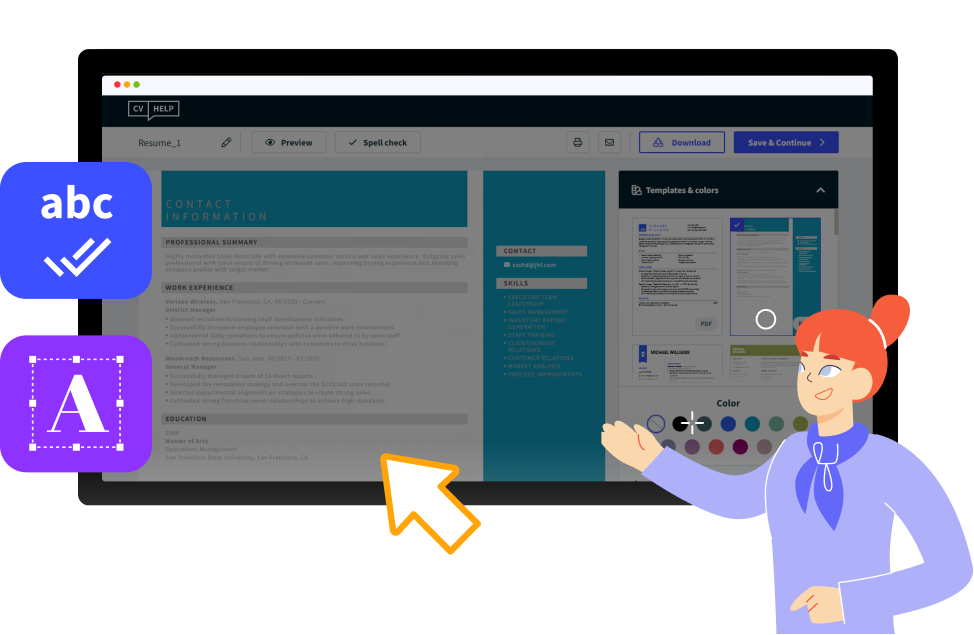
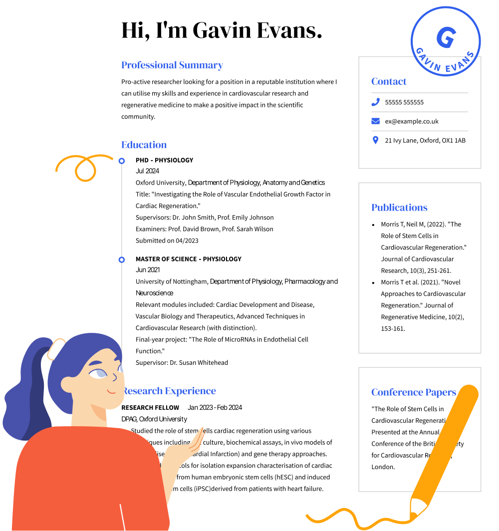
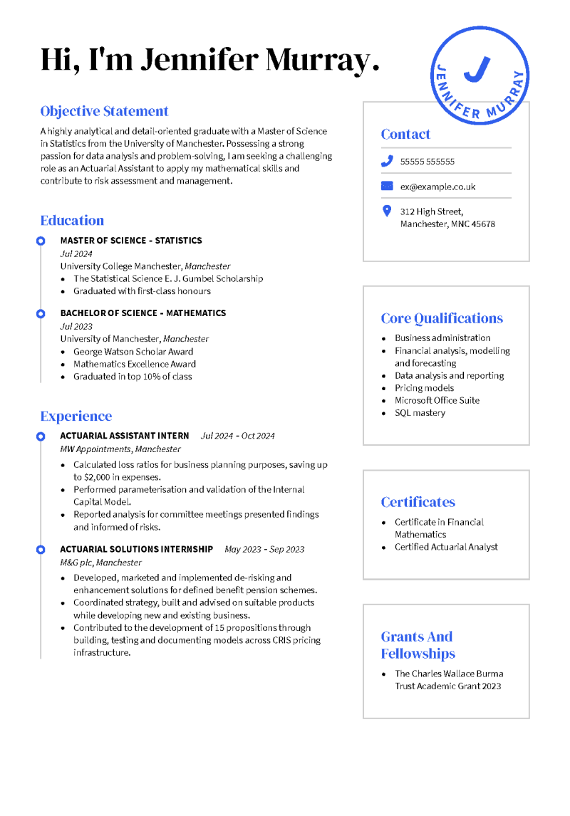
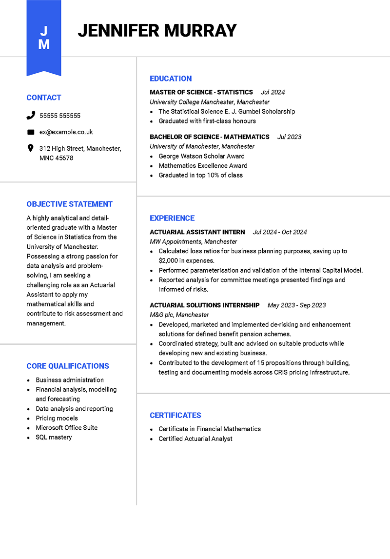
Most CV tips you find online address the content of your CV, but your design and layout are just as important to your job search. CV design consists of everything from the color of your paper to the fonts and formatting. While many would debate how much is too much, the trick is to create impressive designs that show hiring managers you’re the creative and innovative person flush with outstanding ideas the CV says you are. With today’s technology, CV design has included graphics and video. But one should be prudent with these tactics. Asking a hiring manager to review your online CV shouldn’t take up too much of their time. Even as you try to impress, keep it simple and brief.
Be smart with visual space
Your CV design can either encourage or distract. Avoid widening margins too much. Don’t crowd text to get more information onto the page and absolutely do not use fonts smaller than 10. Use uniform spacing between sections, headings, text and bullets. Keep as much white space on the page as possible because it promotes a clean look and encourages a visual hierarchy.
Stand Out with a Professional CV!

Use text wisely
It’s been proven time and again that people love bulleted lists. They will ignore large chunks of text but will carefully review bullets. Unfortunately, the advent of online CV has given candidates reason to avoid bullets as sometimes they don’t translate to some mediums. However, the advantages of bullets should not be underestimated. Create CV in three different file types: .doc, .pdf and .txt. (For .txt, use dashes instead of bullets.) The majority of online submission forms take one of these.
Be selective about fonts
Avoid using a variety of fonts. It can be distracting. Stick to one or two readable fonts, and be consistent throughout the resume design. For example, use one for headers and one for body text. Shrink fonts only one point in the hierarchy. Studies have shown hiring managers will go straight to company titles and employment dates, so make them stand out with a bold or italic font. Depending on the open position, you might be able to include graphics, but this should only be used if the position is design-oriented. If you’re applying for paralegal or a less visual job, keep the design simple while still structuring a visually captivating CV.
When you’re building your CV, the design can make or break your chances of landing the job. Follow these CV tips and simple graphic principles to ensure that your design and layout are working for you rather than against you.


